A neighbour at Wamboin quizzed the table at dinner.
No painter had explained why they use colour. What purpose did it serve?
A satisfactory answer would remove the pleasure of the riddle. At dinner.
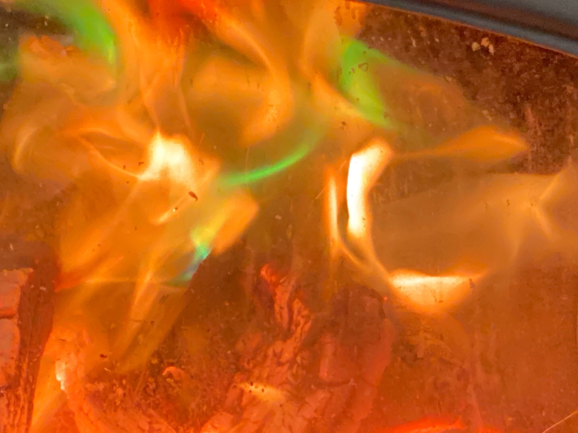
Fire with green flame
Painting celebrated liberation from the brush with stained canvasses in the 1970’s. Paint was applied directly to the canvas. Colour was integrated into the material of the canvas. The photo above emulates the stained canvas.
Without the burden of subject, colour went free range. It was allowed to swell or contract. It could spread according to the volume of paint applied. Relations between colours and shapes were improvised, responding and listening to the each other, seeking out unity, harmony, clarity and pleasure.
In the instance above, the viewer is intrigued by the surprise appearance of green, uncharacteristic of fire colour. The viewer slips from the vacant pleasure of colour to anxiety about a toxic substance in the fire.
Red flames
We are pleased therefore in the second image to see employed a red, which competes with the green more compellingly. The green is more alive. It is happier and dancing more freely. It invites a companion too. A minor part, but the yellow in the top right corner makes a welcome site. We have been consumed by the pleasure and forgotten about the toxicity factor.
Green’s loss of composure
One voice in a group can fail to listen and therefore not happily integrate the other voices. Above, green rejoices at the expense of not only the other colours, but also the space of the picture has become claustrophobic. Harmony is out the window.
Happy as a button
The green here is positioned and sized to perfection. It resonates happily in the space, as happy as a button. Even despite the presence of the shadow corners!


